For my final Project in a GIS course I took I looked at the shifting economic fortunes and political ideology on a geographic basis.
First, politics:
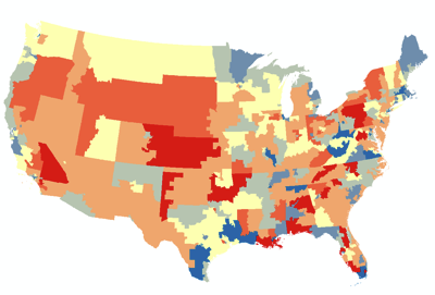
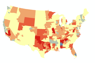
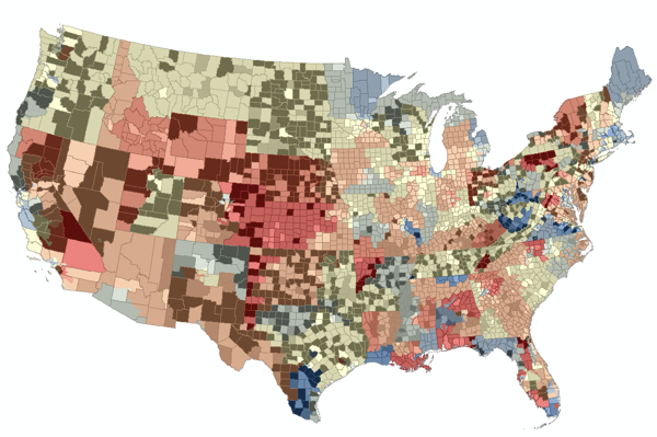
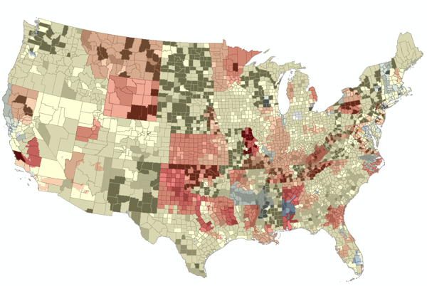
I was curious how American political ideology had changed amongst the populous since 1980. (The data to do this was hard to get under the time constraints I had, so I revised it to between 2000 (i.e. before "terrorist" was a word one heard or read all too often) and 2010.) I looked at congressional district election returns as a proxy for ideology of the populous for several reasons: (1) congressional elections are the most "local" political race with national coverage, (2) they are easier for minority parties to be contenders in, and (3) due to their diversity of views and their "locality" they may be more representative. After researching more than 40 political parties' platforms, I associated values [-1, 0, +1] and labeled them as "Left/Liberal" (socially-progressive, pro-big government; +1), "Right/Conservative" (socially-conservative, anti-government; -1), and "Centrist/Alternative" (Greens, Independents, Unknowns; 0). I then produced the following maps in ArcGIS, summing the values (after weighting them by percentage of election returns) to color them (positive numbers, blue; negative numbers, red; zero, light yellow).
 |
| US Ideology 2000 |
 |
| US Ideology 2010 |
Next, Income:
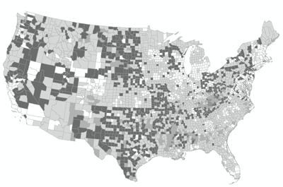
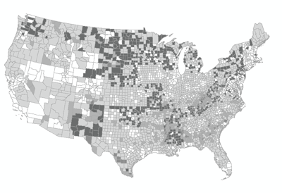
I then looked at income data on a county level from the Census Bureau. Because averages can be drastically skewed by outliers, I specifically looked at median income. I was also interested in poverty so I looked to incorporate this into my economic measurements. What is the poverty threshold? Well, that depends who you ask; and if you ask the Census Bureau, it depends on the number of dependents in the household. Faced with a dilemma of which number to use, I chose the Census Bureau figure for a household of 3; this was $13,738 in 2000 and $17,374 in 2010. I then calculated the percentage of median income above these numbers, thus a low or negative percentage would indicate the median income of the county was close to or below the selected poverty threshold, and a large number would indicate how far above this threshold the median income of the county was. For example, a county with a 200% figure would indicate a median income of $27,476 in 2000. I symbolized this information as five greyscale bins (darker greys are lower (percentage) values):
 |
| US % of median income above poverty, 2000 |
 |
| US % of median income above poverty, 2010 |
Overlay & Conclusions:
We can overlay these maps by year to get a composite view of Ideology and Income:
 |
| Composite Map, 2000 |
 |
| Composite Map, 2010 |
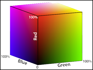
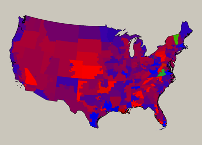
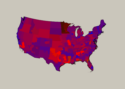
In conclusion, we can say there has been a shift to the political Right between 2000 and 2010; and, despite the Great Recession, people seem to be doing a little better economically. However, there are some flaws in my methodology and there are many complex economic interactions that could serve to make it seem like there is an improvement in income. For example, inflation wasn't explicitly taken into account, so incomes may have risen, but their purchasing power may have stagnated or gone down. Further, the symbology of the ideology maps confuses situations in which voters voted for an alternative party and where near equal number voted for opposing parties (.i.e. increased polarity). Another way to symbolize them would be to assign the percentage of votes for each ideology as RGB (Red-Green-Blue) percentages (of 255). Doing so, we would get the following maps:
 |
| US Ideology 2000 as RGB |
 |
| US Ideology 2010 as RGB |
These can be hard to interpret, due to the average human's ability to perceive color differences. Further work awaits.
